Artist Feature: Sarah Moore

This month I had the chance to sit down with Knoxville painter Sarah Moore for the first official Balltower Artist Feature Interview. She’s great.

Sarah is a fitting first feature/interview for me because she’s actually part of the reason I’m working on this blog.

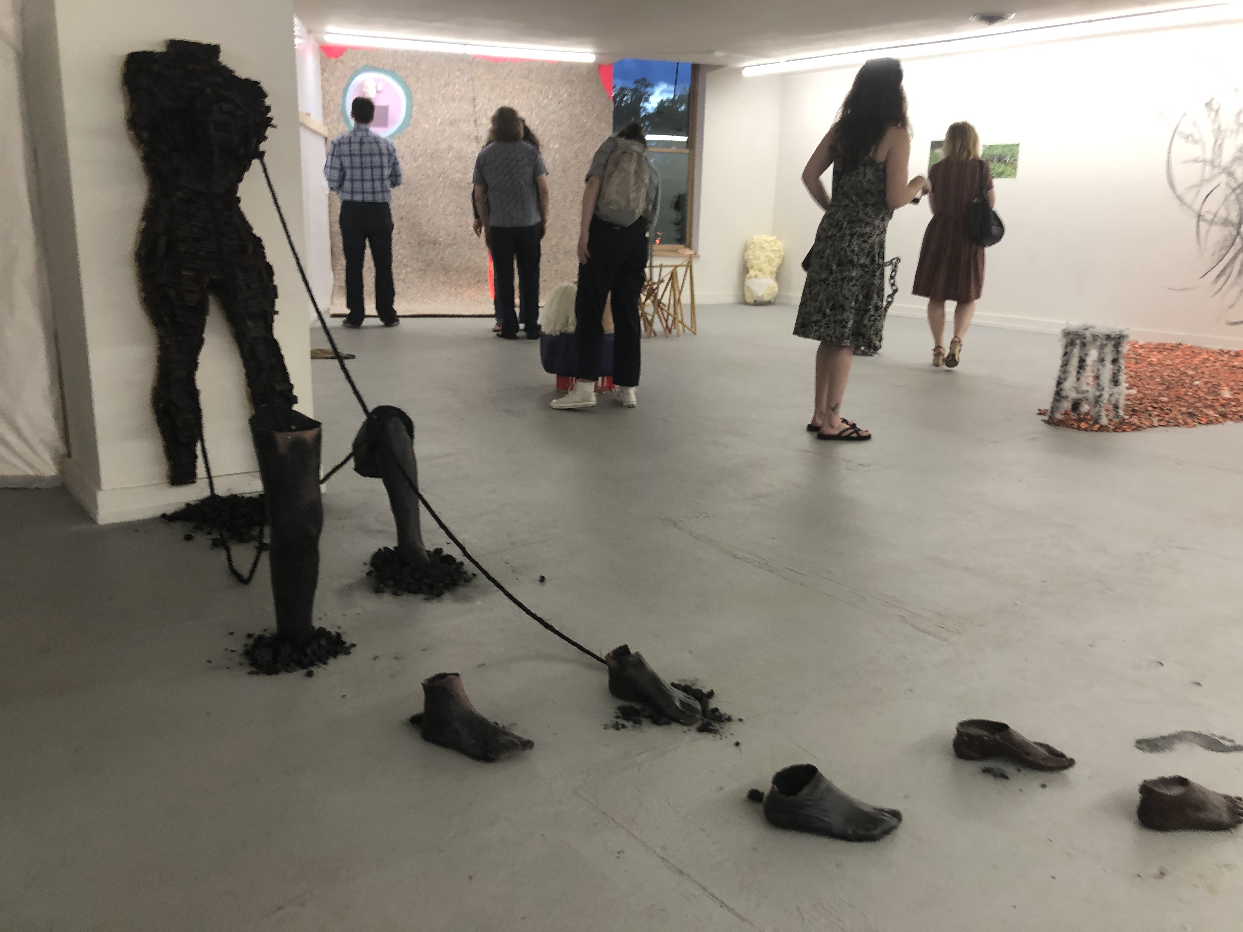
I used to be really frustrated with Knoxville. Where I saw real potential for good work and a thriving art culture, I found my hope was betrayed. The city couldn’t muster enough curatorial courage to discriminate between vital, evocative art and $35 handmade necklaces. Going to galleries and little shows, I saw the chasm between consumer decor and outsider weirdness too large to have hope. But a few years ago, walking through a Dogwood Arts Festival in Market Square, I came across Sarah Moore’s work and my hope was renewed.

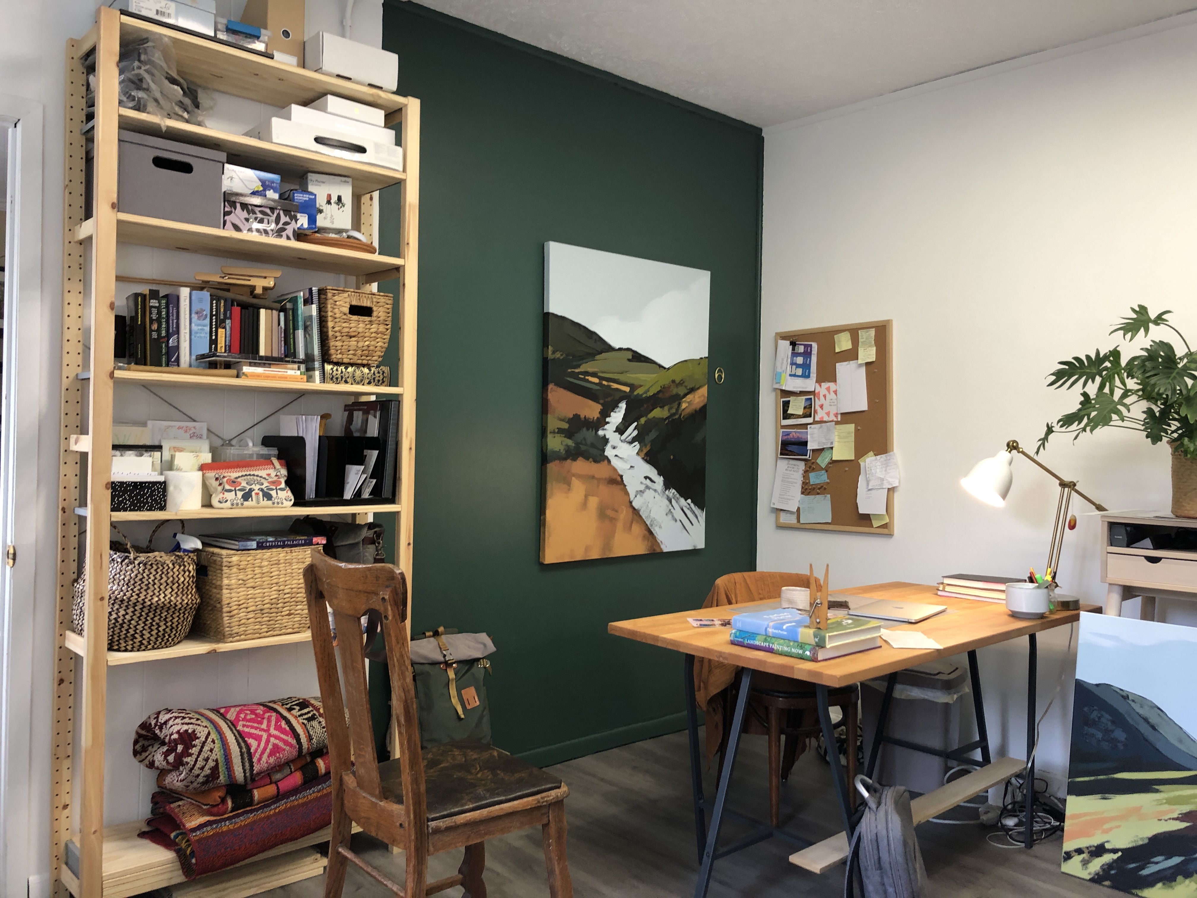
Here were paintings that sat comfortably within the consumer genres nearby at the festival (plants, landscapes, decor), but also just far enough outside of them to make me feel something. Sarah had left portions of her pieces unpainted, brush strokes shot across a seascape to represent rocks, bushes grown from the slice of a palette knife.

Untitled, Sarah Moore

Sarah’s painting depicts a recognizable image under the duress of perception. Which means the image captures things difficult to capture with paint–things like time and memory and emotion. The paintings often look “in-progress,” as if the attempt to freeze a memory or vision in the mind was always half-complete (as memories always are) or the true sense of a place was always evading understanding (as places always are, and especially the grand landscapes that make up most of Moore’s stuff).

Her work left an impression on me after that first encounter and I started poking around Knoxville for more art. I started a habit of gallery visits and Instagram rabbit trails. And eventually, I started Balltower.

Longing, We Say; Sarah Moore

So it was cool to meet up and chat about Knoxville, planting trees, and how she landed on her blend of abstraction and realism.


BT (Balltower): How did you start painting?

SM: I had always painted and done creative things, and I went to school for architecture, where of course I was drawing and sculpting. But I was making stuff all the time. I had an understanding of the technical stuff before collegeโ€“color-theory, foreshortening, perspective.

BT: What made you switch to just painting? Did you pursue architecture?

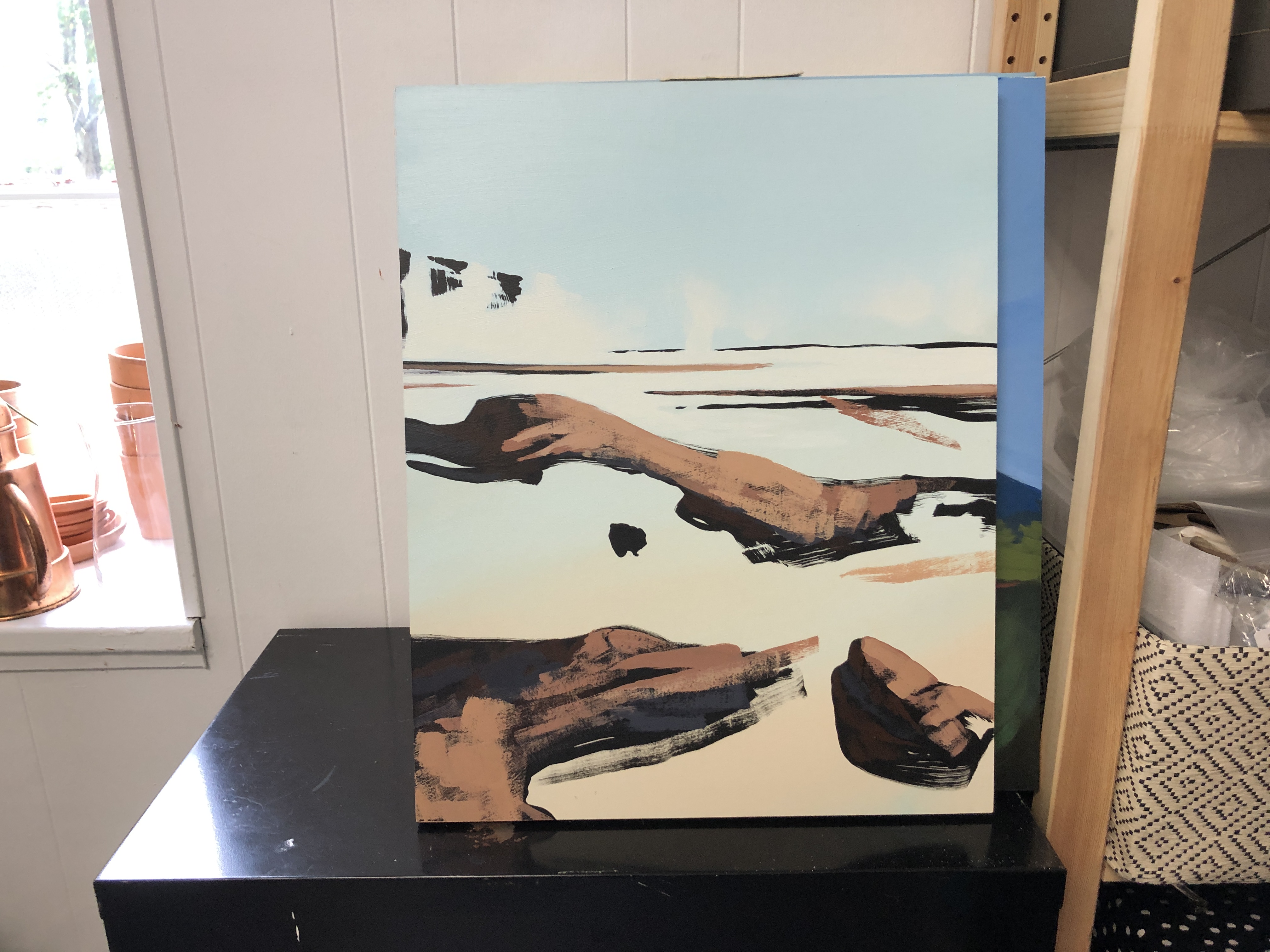
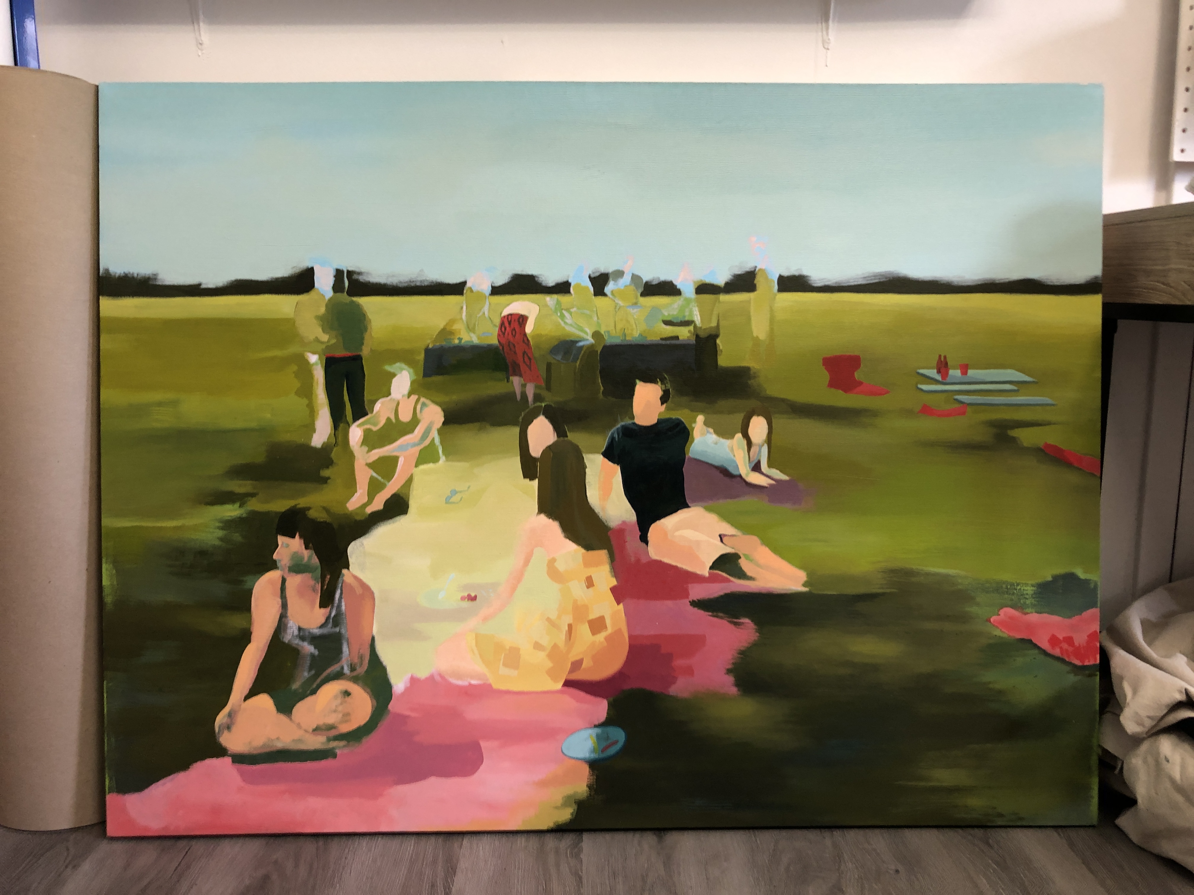
SM: By my last year of architecture school, I was at a very low place. I was burned out. I took some time off to find myself and knew pretty quickly that architecture wasn’t right for me. So I was in this low place and I drove out to a craft store and bought some tubes of paint and a canvas and I painted that [she points to the wall behind me at the painting shown below].

Before We Go, Sarah Moore

BT: That looks similar to your recent work. What about that first painting felt right?

SM: Part of it was the actual scene itself. I was in school in St. Louis, and May in St. Louis is paradise. That day was pure joy. Most of the people in the picture had just graduated so we had this huge celebration picnic. It felt like garden-of-eden-level perfect. I took a picture of it that I loved, but I never printed it because there were elements that I didn’t like. There was trash on the ground. Stuff like that. So I took the photo into photoshop and took that stuff out. But then I kept going. At first I removed a cup here or there and then a chair and then I eventually took a whole tree out.

BT: It became more abstract.

SM: Yeah, I kept taking stuff out until I felt like there was a moment of breathing. And since Iโ€™d been so covered up with school, it had been maybe five years since Iโ€™d done much painting and I had to figure out how to paint again. I just needed to get into it, but that was my most important breakthroughโ€“I started drawing with the paint itselfโ€“

BT: Instead of plotting it out beforehand with pencilโ€“

SM: Yeah, and so I made a lot of perspective mistakes. It’s not really an accurate picture any more. There were a lot of things that were honestly just mistakes. But I liked how it looked.

BT: What about those particular mistakes felt exciting to you?

SM: So, the perspective should actually be more collapsed based off of where I was standing. All of the faces should be closer. But I spaced everything out and everything felt like it was floating. And the way that I was blending the grassโ€“there was just this weird sense of ephemerality and movement. There were certain details that I got stuck on for some reason and other places where there was no detail. It felt like memory feels. Weightless and moving.

BT: What about your colors? Your colors aren’t sourced from a typical landscape palette. They are what I would call impossible or post-digital colors. Especially the blues you use for skies. Did you just mix a blue until you found one you liked?
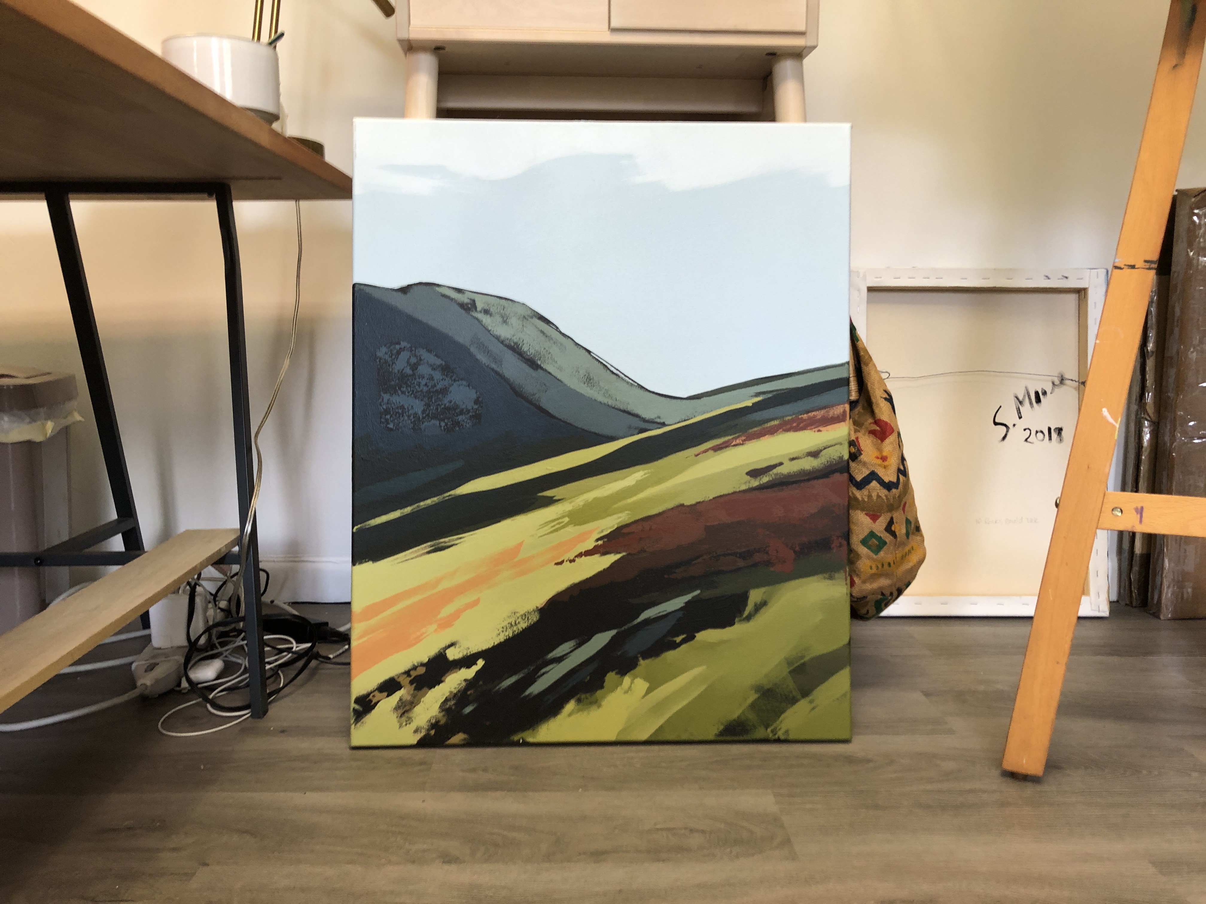
Geological Time, Sarah Moore

SM: Mhmm. Iโ€™ve been lucky to travel some and see places relatively unspoiled with the human footprint. I had been to Ireland, and there was this day on the Aran Islands where I was looking out to the horizon and the sky was teal. It wasnโ€™t blue. The air was so clean that the sky was teal. After that I would look at the sky and think, โ€œWow. That sky is really dull compared to what I know it could be.โ€ So I think, in a way, thereโ€™s a sort of denial of the world Iโ€™m actually in and Iโ€™m chasing a cleaner, more pure version.

BT: It sounds like many of your choices are motivated by idealism.

SM: Yeah.

BT: How do you think idealism can function productively? A lot of art feels tasked with being challenging or gritty. Is it not more important to make what some people would call “honest” pieces that expose truth?

SM: There’s the selfish sense that I just find it more enjoyable. There are all kinds of things happening simultaneously: there are gorgeous, free sunsets every day and then there are mass shootings. That’s just the tumble of life. And I’m an optimist. You can train your focus on anything. My mental state actually tends toward depressive things like climate change. Culture trains us to dwell on violence and outrage.

BT: So, we’ve got this idealism and something else that keeps coming up: fleeting time. What relationship do you see between those two? Momentary glimpses and optimism.

SM: I think theyโ€™re tied to progress and urgency. Like youth that are going on strike for climate changeโ€“theyโ€™re fighting for something transient, theyโ€™re saying, โ€œWhatโ€™s the point of going to school if this stuff isnโ€™t going to be here for much longer,โ€ but also any strike like that is motivated by idealism. Iโ€™m energized by being back in the places I paint. Natural spaces. And when I think about the few places Iโ€™ve been that are relatively untouched, I want to make people aware of how beautiful they are. Thereโ€™s a sense of urgency.

Untitled work-in-progress, Sarah Moore

BT: Concerning climate change: do you hope that your work would encourage political or conservationist action?

SM: I think some people are really good at leading movements and galvanizing action. I don’t think I’m good at that. What I might be good at is creating a space where people can breathe and ask a question. So I would rather my work be something that makes people mindful of beauty in a new way. That they maybe just see a little bit more of it. And I think, over time, people who see something value it more than they would otherwise.

Double Take: First Friday, June 2019

“Double Take” is a new feature where I spotlight art that made me stop and pay attention. My hope (along with my hope for the entire site) is that I could encourage audiences and viewers to slow down and dig into works despite the ever-present volume of material to consume in the digital age.

June’s First Friday coincided with the Dogwood Arts Regional Exhibition and a steady rain, which, thankfully, drove people inside to spend more time with pieces that deserved quality time.


See if you can spot what these three pieces have in common:

Untitled Construct 6 by Donald Keefe
Untitled by Brianna Bass
Untitled by David Wolff

Untitled! All of them! Which is great: these abstract pieces are valuable precisely because they are non-verbal. Works like this strong arm our language-dependent brains out the door. What remains are our senses, and what a gift. Bombarded by advertisements and social media, what a treat to be offered an image celebrating color, form, harmony, etc. without a call to action. David Wolff’s painting is the sort that is wild enough to produce curiosity from across the room but unified enough at close inspection to beckon deeper consideration. Colors from a landscape palette take on landscape forms, but without a discernible horizon, suggesting a riverside scene painted from every angle at once, moving fluidly between POVs as a river itself might.

My favorite painting at the show? Yet another titled Untitled. This time by Amanda Nolan Booker from Chattanooga.

As far as the painting’s subject, I can only offer my best guess. We’ve got flora of some kind suggested by leafy green strokes and dim stems on the right, and something like a small end table propped up on thin legs to the left. It’s a still life, apparently. But, obviously, the subject is being absolutely obliterated by a heavy, burnt orange. The dynamic between discernible image and abstraction is electric. The confused subject is domestic and painterly, but the portrayal swallows the subject whole, at once violent and warm. What’s left is clouded and mystifying, like a memory. Booker elegantly breeds antiquated museum styles like still life and ab-ex and the offspring is refreshing.


Next door, UT’s Downtown Gallery had an exhibition of Carl Sublett’s painting. Sublett was a painting professor at the university through the 80s, and I couldn’t help but draw some comparison’s between his use of paint and Booker’s above.

Tide Flat by Carl Sublett

Again, something recognizable (an ocean inlet) obscured in the process of trying to paint it. Aside from saying something about the nature of reproduction or memory, Sublett is laying color and pure form on top of the scene to exaggerate its formal elements. A haphazard creek or dune is translated as a forking shock of blue and yellow. The horizon is designated from both land and sky as its own brush stroke. The ocean is a dark and deep, stony navy–color suggesting dimension. I agree with all of these choices. Each name an effect the beach has had on me. In the same way that Booker’s work encouraged a reassessment of still life convention, Sublett’s was reviving the landscape painting with unpredictability and (therefore) electricity.


My last stop was Salvage Shop Studios, a tiny upstairs space on Broadway supporting artists Michael Giles and Ashley Addair, who work together under the “Practices Of” moniker.

Their new installation “i.e. interact/experiment” incorporated so many separate elements that it would be hard to discuss the work without breaking down and listing them. The installation included:

  • On one wall of a dark room, a looped projection of Ashley dancing behind superimposed greater-than/less-than signs
  • Sheets of translucent white paper and screen material that hung limply in front of the projection wall and caught bits of the projection
  • Loud, aimless blues music
  • White paint on several surfaces, including the screens
  • Photocopied papers covering the floor, which upon close inspection were apparently Ashley and Michael’s handwritten notes for the show itself
  • Ponchos with “for viewing and being viewed” printed on them and hanging from a wall near the projection

As you can tell from the picture below, the whole thing was staged between three walls and, like the message printed on the ponchos, felt very much like something to both be a part of and spectate.

i.e. interact/experiment by Practices Of

Given the fact that the work sat in a small room only accessible by noisy wooden stairs, the only light in the room came from the projector, and the material on hand was somewhat austere (dance always carries something mystifying and primal about it), the installation achieved an aspect of alien transportation that I felt missing in last month’s exhibitions. But transportation to where?

You can’t help but notice how reflexive and meta the whole thing is. Notes from their process litter the ground. The viewer constitutes the thing to be viewed, at least in part. Things carry a rustic, unfinished aesthetic suggesting that, seeing as this is the studio where both artists currently work, viewers are breaking in on a work in progress. It is artwork about artwork, ostensibly, which can create problems.

For one, since it dramatizes the process, reflexive art risks alienating people that don’t make art. If the art is about art-making, what could non-artists find? On top of that, self-referential art adds a tempting shade of sophistication to a work, and when sophistication is part of the expectation (as it almost always is with the avant-garde), artists can reach too quickly for self-aware commentary instead of bold work about universal human experience.

Practices Of avoided both.

This is me feeling for what was underneath the photocopies. You can tell from my face that I liked what I found. It was bubble wrap.

Here, self-awareness isn’t just particular to artists, but because viewers are complicit in the projected dance, it expands out to include all forms of self-awareness. Interact/experiment’s reflexive nature had less to do with an artist’s pretentious struggle with making art, but rather the common struggle against the very things that keep us from connecting with each other: insecurity, confusion, and prejudice. The viewer is encouraged toward productive vulnerability, just as Ashley and Michael were. They’ve put everything out there, and we should too.

Michael

Western Ave Viaduct by Carl Sublett

The Knoxville Museum of Art’s Summer Exhibition is Phenomenal.

As Knoxville’s primary grown-up gallery, the KMA has some real responsibility to pull. Much like our airport, it is small, has giant windows on one side, and services an enormous geographical radius. This summer, its exhibition “Design by Time” proves that thoughtful curation can make even an hour’s stroll through the modest gallery halls feel well worth your time. Coincidentally, that’s what the show is all about: time.

Specifically, the exhibition is about how invisible forces like time shape the visible world. If that sounds heady, it’s my fault. The show itself is packed with breezy, clever pieces that express themselves quietly and clearly. You really ought to go to this show yourself, so I’ll avoid spoiling many of the pieces. But check this clock out.

“A million Times 80 Copper” by studio Humans Since 1982

See that? That’s a big digital clock made up of smaller analog clocks. It tells the time on the minute, every minute. The clock hands spin individually, forming intricate geometric designs before returning, literally at the last second, to form a digital readout for the current time. This is working intellectually on all kinds of levels–the relationship between the analog and digital (all digital processes start as analog circuits), our perceptions of time in ever-diminishing increments (hours, minutes, seconds, moments), and the beautiful forms apparent when time as a measured quantity dissolves (as the numbers on the clock give way to abstract patterns). But it’s also mesmerizing and valuable in passing as a crazy clock.

That’s ten feet away from this record player:

“Years” by Bartholomรคus Traubeck

Here, the center of a spruce tree has been cut into the shape of a vinyl record and the tree rings mimic the grooves typically intended to catch the needle and generate sound. On a purely visual level, this says something about the insertion of the organic into the artificial. The industrial machine world processing and “playing” the organic, say. But there’s a twist. This phonograph is wired to a pair of headphones and the needle is an instrument capable of translating the grooves of the wood into a wild, atonal piano piece (which of course you can listen to). The implication is literal and astounding: the music you hear is a spontaneous interpretation of the rings of the tree, which are themselves a direct document of time. You hear how the tree weathered the years. Time becomes traceable. Shape becomes sonic. Unbelievable.

During my visit, a nursing home had brought its residents in for a tour. They were seated in folding chairs in a dark corner of the one of the gallery halls. A woman was on her feet, speaking loudly and excitedly to the eighty-somethings about the works and, appropriate for such a show, how each piece came to be. Each work’s history.

“L’รขge du monde” by Mathieu Lehanneur, which visually marks the population of Saudi Arabia’s population through time, top to bottom.

The longer I walked through the show with the wrinkly, gray-headed group in the room beside me, the various ruminations on time and its effect on physical objects–how objects are authored by their histories–pooled into self-consciousness. I saw my shape as a testament to my father and mother, tenth grade basketball practices, grief, and fast food. I left the museum and saw the sidewalk beaten under years of Fort Sanders foot traffic. I saw Knoxville imprinted with rivers and the 1982 World’s Fair. I saw the shaping that has been happening for a long time, on me and around me.

Go give this show your time and it will give time back.

Michael

The Spring 2019 Krutch Park Sculpture Awards

Krutch Park’s south entrance.

Krutch Park (pronounced krootch) is a suffocated little one-acre green space smack in the middle of downtown. Funded by and named after Charles Krutch, who photographed TVA’s massive growth in the middle of the 20th century, it has three picnic tables, a pond you can jump across, and a parking lot you aren’t allowed to park in. According to the sidewalk sign, it was founded as a “quiet retreat for the pleasure and health of the public.” This park also has sculptures, which we are here to give awards to. But first, a word about Charles Krutch and the park itself.


Krutch’s photographs were some of the first identified as “fine art” in the field of photography, and a quick survey of his TVA dam pictures proves why:

Obviously, this type of photograph does much more than document. It captures, with dramatic urgency, the contrast of tiny humans swallowed in the enormity of these energy machines. You’ll miss the Waldo staff members unless you squint.

He’d only been photographing for TVA three years when his work started to be featured nationally in the New York Times. He continued working for TVA until his death in 1981, when he bequeathed the money for his namesake park.

It’s against the backdrop of his work for TVA–his photography’s sublime, sensitive treatment of lifeless, pragmatic superstructures–that we consider the art in Krutch Park. Because the art in Krutch Park is faced with the same challenge Krutch himself faced: how to elicit “A quiet retreat for pleasure” in the midst of concrete walls and corporate logos. The park itself hardly accomplishes this. It’s too small. To sit down on one of its benches produces the feeling of waiting in a very cost-sensible atrium of a corporate high-rise. There are no doubt thirty backyards in Sequoyah Hills that outshine it.

I’m sorry Charles. I’m sure the city did their best with what they had.

Here are the picnic tables.

But what about the art? As far as my research determined, sculptures weren’t part of Krutch’s original will for his park. What can they do for the congested home they find themselves in? Well, that’s the beauty of sculptures like these. At their best, they transform the space into something vitally non-functional. A wonderful kind of non-functional. The claustrophobic half-block opens up into something spacious. Something purely for pleasure. Something worth paying attention to and recognizing.

Five awards. We’ll start with three superlatives and end with our runner-up and best in show.


Most Likely to End Up at Dollywood:
At Home with Higher Thoughts, Charlie Brouwer

As it is, this is too subtle and mystifying for a theme park. So, some ideas for Dolly: Put a pair of silly eyes on this. Hollow out the back for a speaker playing fiddle tunes. Mark the legs with a “yer mountain bumpkin must be yea-tall to ride” measuring line. Punch a hole in the front so an animatronic bird can pop out and whistle Rocky Top.


Worst Bargain
White Stardust, Elizabeth Akamatsu

Did you know that the sculptures in Krutch Park are up for sale? They are. And you can buy White Stardust for fifty thousand dollars. It is, by far, the most expensive piece in the park. The problem is, its also the worst piece. It would have been okay, but somebody decided to emblazon “We are stardust” on its base plate. An interesting sculpture toying with perspective and two-dimensional planes saddled with an Instagram caption. For the price of a Cadillac.


Hardest Not to Climb On:
Space Diamond, Coral Lambert

Possibly the highest praise I can lavish on an abstract sculptural piece is “I want to play on it.” Part of what makes playground architecture so compelling is the sense of absurdity and pointlessness, and sculpture can succeed by the same metric. We find ourselves wanting to climb and traverse. Space Diamond employs rough, construction-ready materials in a playful geometric tent, and looks like an alien cage asking to be explored.


Best in Show Runner-Up:
Ecstatic Crepitacean, Will Vannerson

Here, pipes shine and join like we’ve seen them before in car exhausts and dryer ducts and air conditioning systems. But Vannerson twists them into an organic network, mirroring veins or roots or elbows. The result is neither retro-futuristic or fantasy, but other-worldy nonetheless, provoking comparisons between the organic and the synthetic or the efficient with the beautiful.


Best in Show:
Motion Light, Hanna Jubran

Motion Light is the very sort of sculpture that makes you glad to walk through Krutch Park. It is all of the things I’ve praised above: playful, alien, and thought-provoking. It manipulates the simplest formal conceits–straight lines, primary colors, circles and squares–to create something invitational and childlike without sacrificing sophistication. I don’t think there is any secret meaning here to be puzzled out. Like the other sculptures in Krutch Park, it is meant to be lived beside and strolled past, somehow enlivening those in its proximity. Like Charles Krutch’s photographs, dramatic contrasts (color from color, straight line from curve, etc.) underline what may well blend into the rest of the environment as furniture.


You can find the rest of the sculptures below. If you have a favorite, maybe we can nominate a Balltower Reader’s Choice Award.

Thanks for stopping in.

Michael

Escape Rooms and First Friday

This weekend I went to four different galleries and looked at art for Knoxville’s First Friday. I walked around alone and took pictures of the art on my iPhone while people around me ate tortilla chips and drank.

The experience of these galleries is something like an escape room, if you’ve ever done one of those. Escape rooms are the new hot thing to do for a date or a youth group fellowship. I did one last year in Pigeon Forge with my friend Jeremy.

Here’s how it worked: in a strip of stores including candy shops and Build-A-Bear, one was set up like a theme park attraction, with a tiny vestibule and a ticket counter. We entered this tiny waiting area and picked an “adventure” from an iPad. Adventures are room themes like Prison Break, Gold Rush, and Mission: Mars. As if my group somehow knew I’d later be comparing the experience to the Knoxville art scene, we picked Art Heist. We were paired with another group of five before a door opened in the waiting room and we were taken through a series of dim hallways into a small room that almost felt like a living room. And then you have an hour to poke around and solve a puzzle in the room. Like a Saw movie.

I say it “almost felt like” a living room because you can never really abandon the sense that you are actually in a strip mall in Pigeon Forge. The walls are done up in picture frames and wallpaper, but there are no windows. There are muffled thumps coming from the hallway outside and the adjacent rooms. A giant LED timer hangs from the ceiling.

You are left to wander around this uncanny environment with strangers and talk about how to make sense of the place you’ve been thrust into.

“Moto no Mweya I” by Nyasha Madamombe

The galleries I walked through on Friday night were like these rooms in almost every way. The spaces are often themed. They were set up to look like Galleries with a capital G, complete with coats of neutral white paint and bright lights, but at all times Knoxville was thumping at the door. Even with all of the pretense, I never forgot about Neyland Stadium or the giant banking buildings looming outside at the heart of downtown. The galleries are just attics and garages. At every turn their weary, post-industrial history wheezes at the seams. Groups of strangers walk around and poke at things, squint, move on.


On Friday night, at the Fluorescent Gallery, I found a puzzle. There was an exhibition of UTK grad students called “Glitzwhip” (a name that conjured a sequined dominatrix I couldn’t find anywhere at the show).

On one wall was a funny painting of a torso in underwear, and the torso was depicted as this dripping, brown stuff. Like mud or a turd. “What’s this about?” I thought.

“Ugly Twin” by Gina Stucchio

Given that other pieces in the show focused on mud or dirt in relationship to the body (even though they were by other artists), I was encouraged to pry into this connection. “Okay, bodies are like earth or something. Malleable, maybe. Or fertile.”

About five minutes later, at the far corner of the gallery, I saw something that encouraged further consideration:

“Twinning” by Gina Stucchio

“Alright, Gina!” I thought. This is a sculpture, in the same shape, also wearing some panties. Kind of funny. But it is three-dimensional and made of raw building materials: spray insulation and metal wire. No doubt Stucchio knew the narrative I’d undergo moving through the room. She gave me some freedom to puzzle it outโ€”to consider connections between earth, body, structure, and space. The puzzle started coming together. And really, the way I’m using the word “puzzle,” it could be applied to any interpretative endeavor. I started to “get” something. Things felt designed and intended to communicate something human.

Crucially, though, there wasn’t enough of a breadcrumb trail for me to move much farther than these broad associations. Why are the torsos limbless? Why do they have panties other than to signal their torso-ness? Why is one flat and the other three-dimensional? Why are they both bubbly and the product of some liquid process? These questions ought to be asked by the audience, if only because it is obvious that Stucchio spent significant time and effort producing these objects precisely for this type of investigation. But in pursuing the questions, any answer I could come up with seemed incongruous with any other observation I’d made.

C for Courtside’s dual exhibition worked the same way as Stucchio’s, setting two pieces side-by-side and encouraging comparison via proximity.

C for Courtside

Here, the walls make a U shape around an open concrete space in the middle. Paintings by Carol Burns, a seventy-five-year-old apparently getting tragically evicted from her apartment in New York, took up the walls.

from “They Touch When They Touch” by Carol Burns

These portray bodies contorted, some in shackles, alongside photographs of trauma or pain. I guess I say “pain” because there was a print-out floating around with an interview about torture and war and I assume that was part of the show.

The video installation “SECRET HANDSHAKE” by Chris Collins occupied the central floor space.

“SECRET HANDSHAKE” by Chris Collins

In the video, two digital humans hold hands and slowly contort around each other in a white void, and their bodies and limbs become increasing twisted and grotesque in the dance. Ambient music plays. They remain connected only by the eponymous “handshake” throughout. The video screen is one of a pair, and the chairs provided for the video encourage viewers to hold hands.

So we have two artists, both focused on bodies. Collins’ work is concerned with touch, Burns’ with pain. I suppose this is meant to reinforce connections between pain and pleasure, or intimacy and distance. But I can’t do much more than suppose. Much like Stucchio’s work above, the focus of the work seemed too abstract or broad to evoke much particular feeling. I tried hard to reconcile the different pieces of the show (the interview about torture, the small screens with funny bodily distortions, Burns’ primitivist forms) into some unified effect, but wasn’t registering much of anything that wasn’t purely conceptual, and therefore dead on arrival.

T

There are other pieces I’m not talking about, but I’ll risk sensationalism for the sake of saying anything at all: the art I saw Friday was too difficult. With the exception of one show which I’ll talk about in a bit, First Friday was unrewarding and exhausting.


Art is clarification. Art aims to open sophisticated human experience up, lay it bare. There are excuses for making something absurd, or profane, or complex, but there is no excuse for making something inscrutable. Meaningful art burdens itself with the tension of naming something originally hidden with clear language. In 2019, in the onward rush and pretense of contemporary life, I can’t imagine a more important cultural activity than the clarifying task of art and art-viewing.

There is a very bad kind of art that rejects this burden. You know what I’m talking about. These imaginary artists go home after every empty exhibition and beat their pillow and blame the idiot audience in their city for misunderstanding their work. I didn’t see anything like this Friday. I saw artists genuinely interested in communication and human engagement. But even still, despite these sweet intentions, I never experienced clarification.

Except for what I found at Gallery 1010.

“Gubbins” by Logan Szymanowski

“Gubbins” is an exhibition of dozens of four-panel comic strips illustrated in the Sunday Funnies style. They feature a monkey, usually seated at a typewriter, pondering questions of purpose and existence. In a purely formal way, they’ve already anticipated and answered the problem above. They are approachable and legible comics, and they contain poignant, measured questions about chaos and self-definition.

Printed at the center of the room, and strewn as if freshly issued from a typewriter, are pages and pages of the “Infinite Monkey Theorem,” which suggests that “a monkey hitting keys at random on a typewriter keyboard for an infinite amount of time will almost surely type any given text, such as the complete works of William Shakespeare. In fact, the monkey would almost surely type every possible finite text an infinite number of times.” It’s a little dense, but suggests a fraught relationship between intention and meaning.

Logan Szymanowski pursues this central premise literally, illustrating a caricatured chimpanzee in front of a typewriter and documenting the results. Sometimes the monkey ends up on something profound, sometimes he confounds himself. The strips reinforce the notion of the Theorem that for each meaningful thought we arrive at, there are millions more meaningless thoughts before and after, or rather that delineating the meaningful and the meaningless is largely out of our capacity.

“Gubbins” by Logan Szymanowski

Szymanowski, true to the genre, posts a Gubbins comic every Sunday on Instagram.

“Gubbins” by Logan Szymanowski

Also, and possibly most importantly, it was at the Gubbins show that people were talking about the work itself, facing the walls, engaged and compelled. Like the good escape room, we wanted to talk about what we were seeing. There was something obscure there, and not just obscure but compelling, and we wanted to figure it out. And unlike the other work I saw Friday night, Szymanowski’s choices hemmed in our investigations and produced a focused, productive conversation around the themes at hand.

I felt met and spoken to. Inspired. I hope to see more productive, accessible work of this type in Knoxville, and I’m confident I will.


This is a “first blog post”, and so it includes some grander thoughts about art’s purpose. I don’t mean to write a treatise about art theory on wordpress. But I do mean to talk about what is good and what isn’t, and here at the start, definitions are useful so that if I can spark conversation, we might know where to begin. Let me know what you think.

Thanks so much for reading.

Michael